Varnexilo
Flux Bundle
Flux Bundle
Couldn't load pickup availability
- 📄 Digital file available after purchase
- 🗂️ Long-term availability
- 🔐 Secure checkout
- 🗓️ Content updated in 2026
Self-paced learning overview
Problem Statement
Layouts that work well at one size may become difficult to use when available space changes. Navigation, cards, text areas, and grouped content can become compressed or poorly aligned. Learners may also rely on fixed dimensions that restrict layout flexibility. Larger stylesheets can introduce repeated declarations and conflicting rules.
Solution
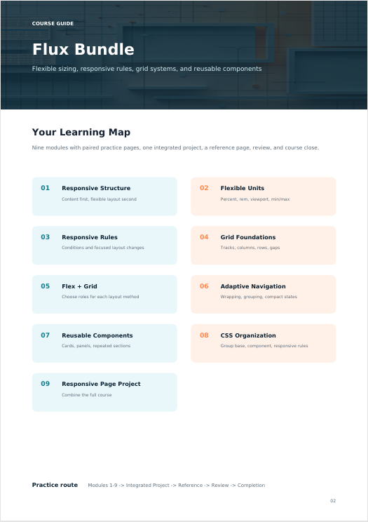
Flux Bundle introduces techniques for building layouts around flexible dimensions and reusable styling patterns. Learners study responsive rules, flexible units, grid-based organization, and content-driven sizing. Exercises demonstrate how page sections can change arrangement without rebuilding the underlying HTML. The course also develops stronger CSS organization through reusable classes and deliberate selector structure.
What’s Inside
- Understand how page sections respond when available viewing space changes.
- Work with relative dimensions, percentages, viewport-based measurements, and scalable sizing.
- Apply conditional CSS rules to adjust layouts, spacing, typography, and visibility at defined ranges.
- Create rows, columns, tracks, gaps, and structured content areas using grid-based layouts.
- Compare layout methods and choose suitable approaches for different content structures.
- Organize navigation areas that can adjust their arrangement as available space changes.
- Develop cards, information sections, content groups, and repeated elements with shared styling patterns.
- Group related rules, reduce unnecessary repetition, and maintain understandable stylesheet structure.
- Build a complete page containing navigation, grouped content, responsive sections, and reusable components.
Who Is This For?
Flux Bundle is intended for learners familiar with HTML structure, selectors, the box model, flexible layouts, and basic positioning. It suits learners continuing from Frame Set who want to study responsive design and more structured CSS organization.
What You’ll Learn
- Use flexible and relative sizing methods
- Create responsive layout rules
- Build grid-based page structures
- Combine different layout approaches
- Adjust spacing and typography across layouts
- Create adaptable navigation structures
- Build reusable content components
- Organize larger groups of CSS rules
- Reduce repeated styling declarations
- Diagnose overflow and alignment issues
- Structure responsive multi-section pages
30-Day Refund Policy
The course includes a 30-day money-back period according to the applicable refund terms.
Certificate of Completion
The course includes a certificate of completion, providing a record that the learner completed the Flux Bundle course materials.
Share
Does each course include practical exercises?
Does each course include practical exercises?
Yes. Practical work is included throughout the collection. Activities may involve writing HTML structures, applying CSS rules, organizing layouts, working with selectors, adjusting spacing, and combining concepts into complete page sections.
How are the courses structured?
How are the courses structured?
Each course is divided into focused modules covering specific HTML and CSS concepts. Materials combine explanations, code examples, practical exercises, and small page-building activities so learners can study concepts and apply them in context.
Do I need previous HTML or CSS knowledge before starting?
Do I need previous HTML or CSS knowledge before starting?
No. The Varnexilo collection is arranged as a progressive learning path, beginning with introductory concepts and gradually moving toward more detailed HTML and CSS topics. Learners can begin with the level that reflects their current knowledge.